CAD4TB ROC-curves
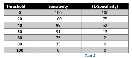
An ROC curve is created by plotting the true positive rate (sensitivity) against the false positive rate (1-specificity) at various thresholds. You can see the ROC curve yielded by CAD4TB for a set of X-rays and some sensitivity and specificity values at different thresholds below in Table 1 (and translated graphically with an ROC curve in Figure 1).
DEFINITIONS
• Sensitivity: Proportion of positive images (i.e., having TB) correctly labeled as positive.
• Specificity: Proportion of negative images (i.e., not having TB) correctly labeled as negative.
• ROC curve: This curve is created by plotting the True Positive rate (sensitivity) against the False Positive Rate (1-specificity) at various threshold settings.
• Threshold (T-value): This the value set by the user to determine which images are labeled abnormal/normal.
• Az: Area under the ROC curve. This number estimates the probability of correct ranking positive/negative. It is bound between 0 and 1: the closest to 1, the better the system’s performance. 1 means a perfect classification.


To summarize: An ROC curve demonstrates several things/characteristics of the test:
- It shows the trade-off between sensitivity and specificity (any increase in sensitivity will often be accompanied by a decrease in specificity).
- The closer the curve follows the left-hand border and then the top border of the ROC space, the better the test´s performance.
- The closer the curve comes to the 45-degree diagonal of the ROC space, the worse the test’s performance.
- The area under the ROC curve is a measure of the test’s performance.